MAX TEMPERATURE VS. LATITUDE
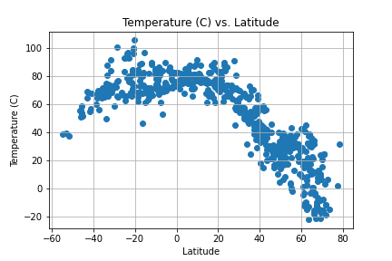
The graphs appear to show the closer the city is to the equator (0 latitude) the higher the temperature appears to increase. The higher temperature are shown to be around between -20 to +20 degree latitudes. As the cities go below the equator into the negative latitudes, the temperature begins to decrease.
MAX TEMPERATURE (Northern & Southern Hemisphere) VS. LATITTUDE
.png)
.png)
A strong correlation was identified between temperature and distance to the equator. Relationship was observed to be more prominent for the Northern Hemispheres (r-value = -0.8655922068698317). Southern Hemisphere still had an observed medium correlation for temperature to latitude.
VISUALIZATIONS
Temp vs Latitude
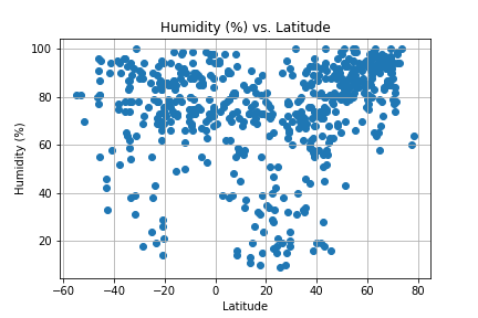
Humidity vs Latitude
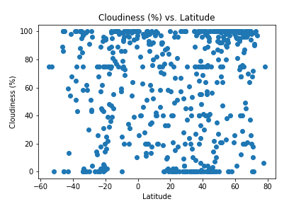
Cloudiness vs Latitude
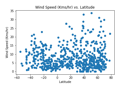
Wind speed vs Latitude