SUMMARY: WEATHER PLOTS
(LATITUDE VS. X)
This project was to analyze how weather changes across 500+ cities across the world vary depending on the distance form the equator. To accomplish this analysis, OpenWeatherMap API and a simple Python library (and a little common sense) was used to create a presentative model of weather across the world cities.
Matplotlib was then used to build a series of plots to showcase the relationships regarding several variables of weather vs. latitude.
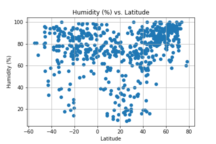
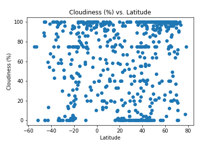
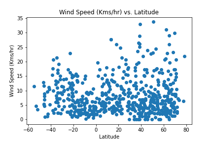
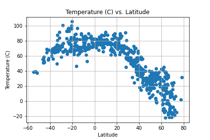
Relationships analyzed included: Temperature (C) vs. Latitude, Humidity (%) vs. Latitude, Cloudiness (%) vs. Latitude, and Wind Speed (km/h) vs. Latitude.
Data and visualizations are are provided as part of the analysis, including explanations and descriptions of trends and correlations.
VISUALIZATIONS